
MEO Sign-up
Experience
Design Process
Discover
- Desk Research
- Competitive Analysis
- User Survey
Define
- Heuristic Evaluation
- Persona
- Pain Points
Ideate
- Brainstorming
- User Flow
Design
- Wireframes
- Hi-Fi Screens
- Prototype
Desk Research and Competitive Analysis
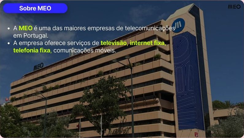
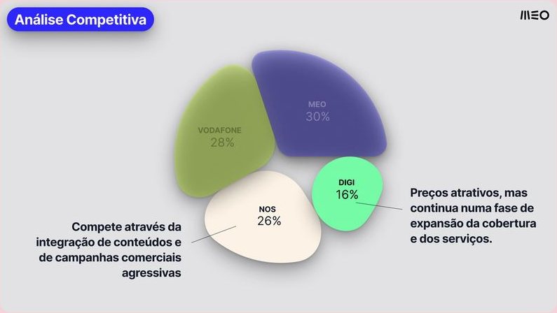
We started with desk research on MEO, one of the largest telecom companies in Portugal, offering TV, fixed internet, landline and mobile services, plus extras such as home security, electricity and health solutions. Our research showed that unclear contract conditions, costs and loyalty periods make sign-up harder to understand, and that MEO’s digital experience influences the decision of new customers. I then carried out the competitive analysis, comparing MEO with Vodafone, NOS and Digi.
Heuristic Evaluation
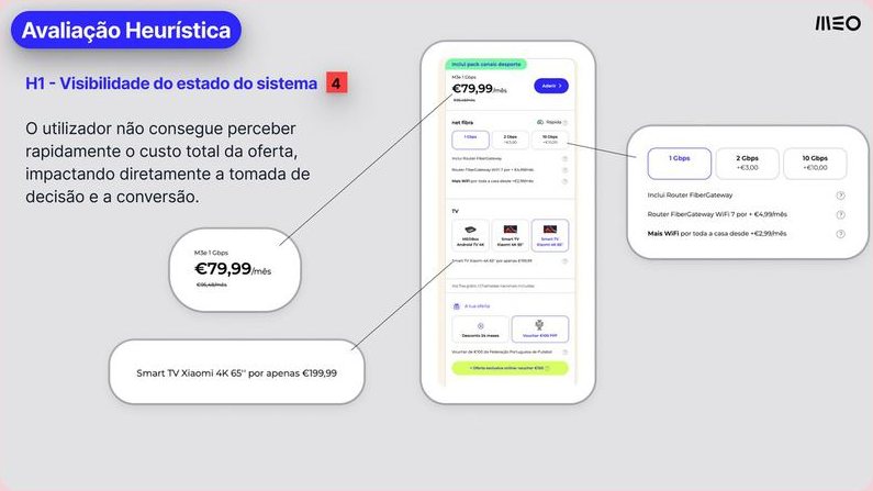
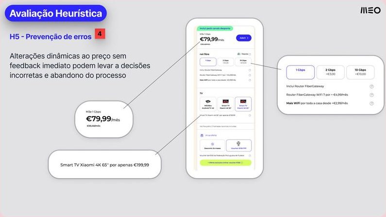
I evaluated MEO’s plan page against Nielsen’s usability heuristics. Two issues were rated 4 on severity. Visibility of system status (H1): users cannot quickly see the total cost of the offer, which hurts decision-making and conversion. Error prevention (H5): dynamic price changes without immediate feedback can lead to wrong decisions and abandonment of the process.
Survey and Persona
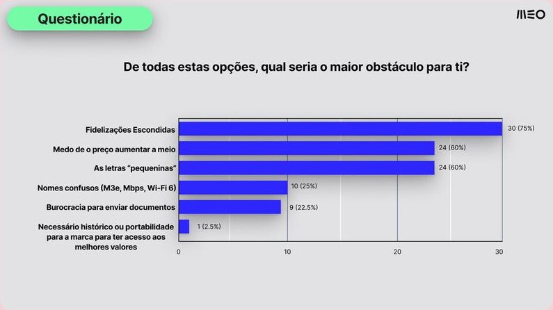
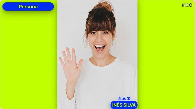
As a team, we ran a survey about the plan sign-up experience: 52 responses were collected and 40 from our target group were analysed. The biggest obstacles were hidden loyalty periods (75%), fear of the price rising mid-contract (60%) and fine print (60%). When asked what went wrong during sign-up, 37.5% said the final price differed from the advertised one and 32.5% pointed to the excessive number of steps and data requested. These insights shaped our persona, Inês Silva, who is signing her first plan and fears committing to something she doesn’t fully understand.
Ideation and Wireframes
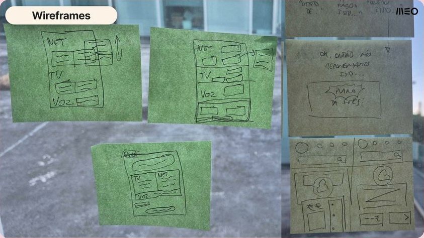
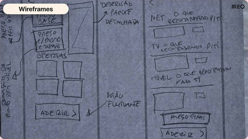
Brainstorming started inside and outside class, bringing together drawings, comments and ideas to help our persona. From there we defined the user flow and designed the wireframes: a home page with plan-summary cards and a central “Suggested for you” card; a plan page with price, join button and loyalty period always visible; and a step-by-step sign-up with the monthly fee and loyalty highlighted at every step. I designed some of these wireframes.
Prototype
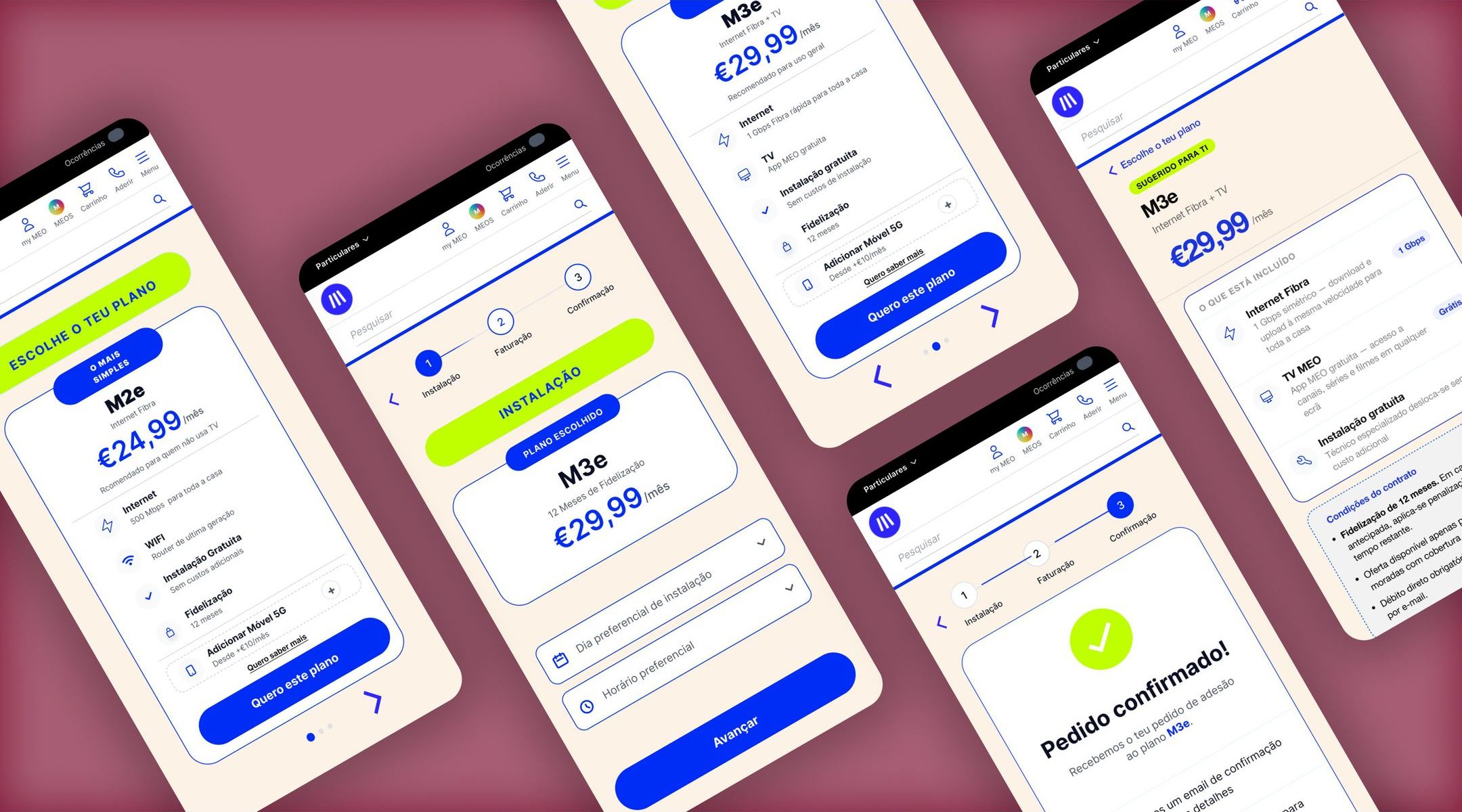
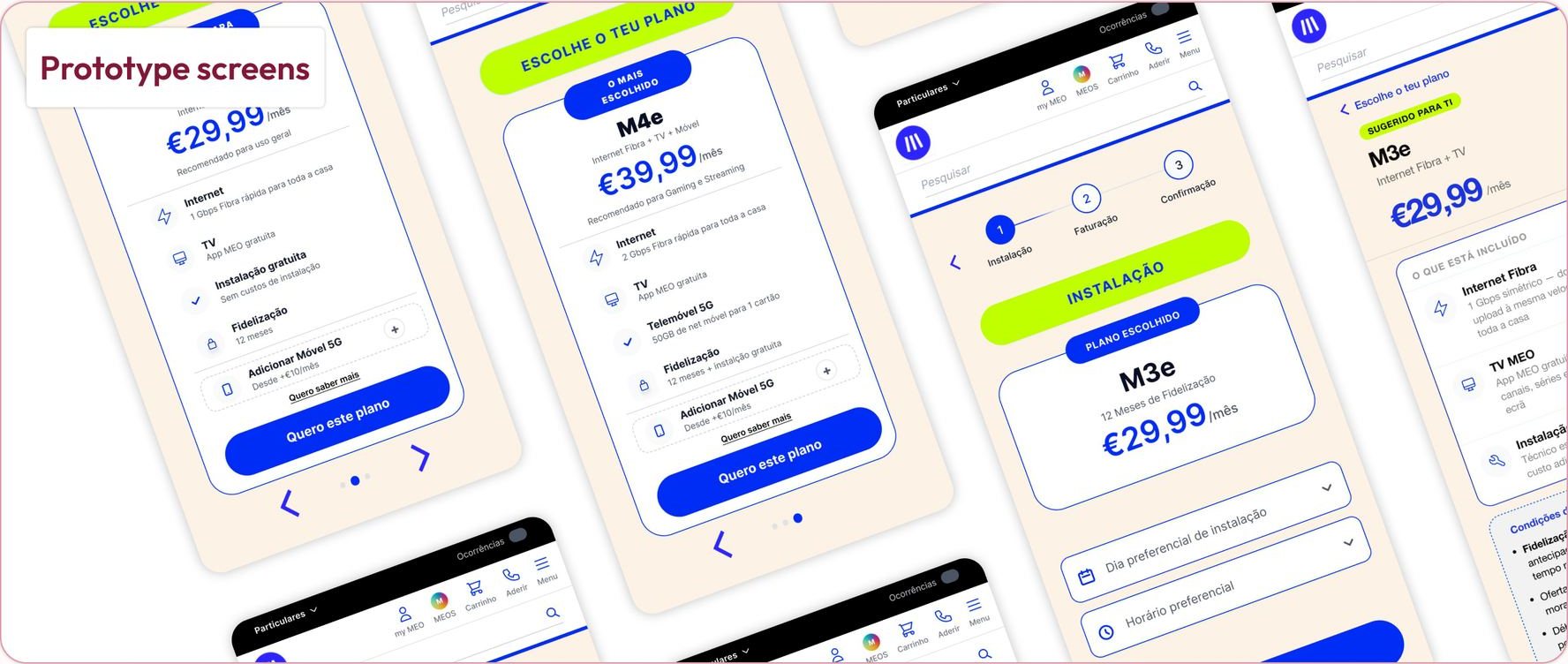
The wireframes became high-fidelity screens and a clickable prototype in Figma, ending in a confirmation page with feedback by email or phone. I designed some of the prototype screens. Explore the full prototype here.
Design Principles
Three ideas guided the screens: show the price and the loyalty period clearly and always, keep the sign-up in short, clearly numbered steps, and give users feedback at the end of the process so they know it was completed.
My contribution
Competitive analysis of MEO, Vodafone, NOS and Digi, heuristic evaluation of the plan page, part of the wireframes and part of the prototype screens.
Team
A group project developed with Luís, Maria and Rodrigo.
Conclusion
The result is a digital experience that makes it easier for Inês to sign up for her first telecom plan, with clearer prices, visible loyalty periods and a simpler process.